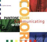
 This book is always within arms reach when I’m designing. I like how it shows examples and breaks the colors down in to moods like happy, friendly, playful, spiritual, earthy and so much more. Then it shows you the color selection process based on the following:
- Define the message: Is it serene, sensual or spiritual?
- Should it suggest sweet tastes or scents, cleanliness or class?
- Choose supporting colors to reinforce the message.
- Fine tune choices for appropriateness to target audience.
- Utilize the combination starting on page 64 as a “launching pad”.
Each section has a page of many 3 color combinations including the dominate, subordinate and accent colors.
So, how would you use this in an EasyDigitals.com template? Here is an example of how this can be helpful to you.
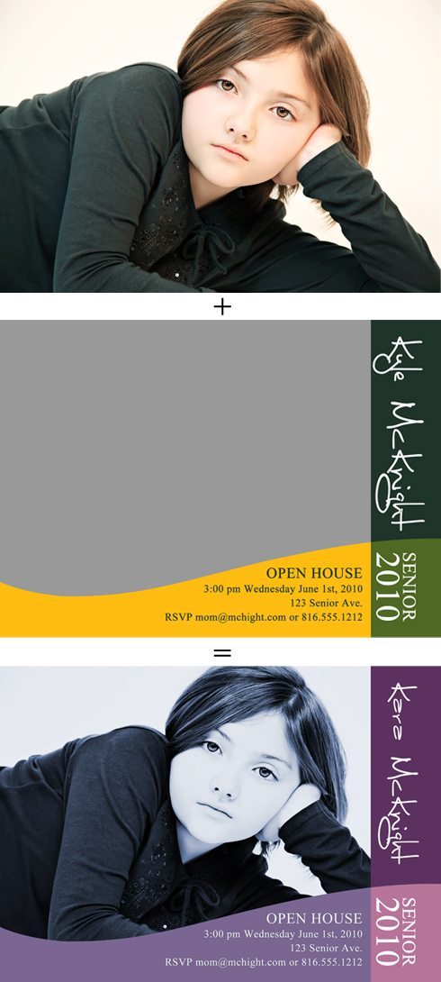
- Choose a photo and a template as I have illustrated below. This template is from Photo Annoucements Vol 3.
- Here I defined the message that I wanted to evoke as Serene and Spiritual. I decided the colors under spiritual would illustrate the message I wanted.
- I went to page 76-77 of the Pantone Guide to Communicating with Color book and chose a palette that I thought would work. In Photoshop, I clicked on the layer “color fill” that I wanted to change, then clicked on “Color Libraries” (make sure that Only Web Colors is NOT checked). Under “Book:” go to “PANTONE solid coated” for most of colors in the book. Start typing the number for the color and the color will appear. Click “ok”.
- Then move on to the other 2 colors and do the same thing.
- Before I started, I converted this image to Black and White with TRA2 Milk and Cookies action. Then I clicked on the Hue/Saturate layer adjustment and clicked on “Colorize” I moved the slider until I liked the color tint of the 2 toned photo.
