The folks over at Topaz Labs have generously offered 3 lucky people a free Topaz ReMask 3 Plug-in. Topaz ReMask 3 offers you the easiest way to isolate objects and remove unwanted backgrounds from images. That’s why it’s a perfect match for these Layered backdrops!
To enter the contest is easy. Just add a comment below stating which of the layered backdrops below you like the best and why. That’s it! You can enter only one time and the contest is going until March 31st, midnight, central time. Good luck!
The winners will be picked by random.org on April 1, 2011.
Learn all about Topaz Remask and watch the tutorials here.
Related product: Layered backdrops
128 replies to "Contest: Win Topaz ReMask"
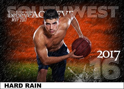
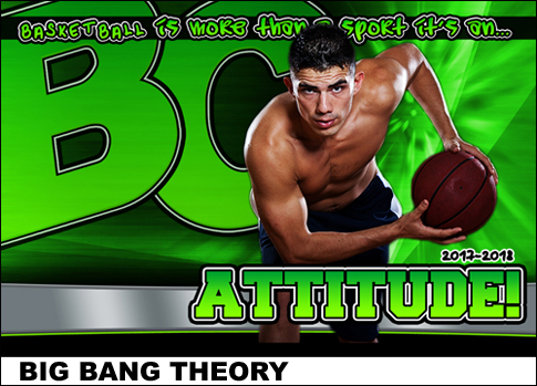
To be honest I like them all, except that is the last one. The green is just to overwhelming. As for my favorite one, well I like both The Action Zone and Hard Rain, but guess I’ll go with Hard Rain being my favorite. The subject already has somewhat a wet look to him (hair appears wet – from sweat I guess) and that look really blends very well with the layered background.
I like the Hard Rain one. It’s got more attitude to it I think.
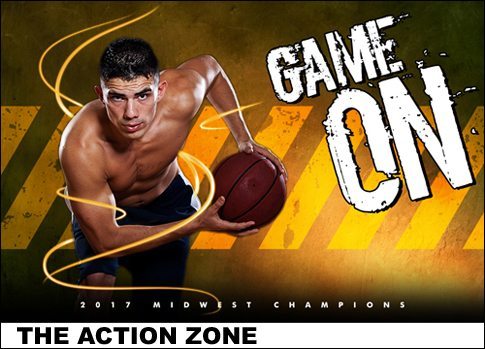
The Action Zone is my fav and the reason being… as much as he is “cut out”… he still blends in with the colours chosen for the background. I don’t know if that makes sense or not, but he just seems to blend a lot better with the colour pallette on the first.
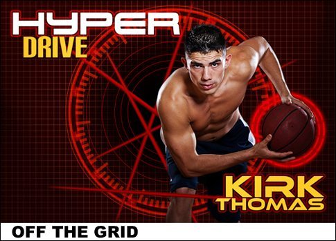
Second fav would have to be “Off the Grid” as yes… he stands out… but the background isn’t pretending to be anything but a digital background… He blends in to the futuristic scene as the whole backgound/cut out just works that way.
I like the hard Rain one the best… serious look,, and it looks like he is actually working out in the rain… a dedicated athlete!
I LOVE the Soaking wet template. I like them all except Big Bang Theory. It’s just TOO much green for me.
Thanks for the giveaway. I could REALLY use the Topaz Remask.
I must admit it was a hard choice between The Action Zone and Big Bang Theory. I like both for their ‘wow’ factor and clean lines. However I pick The Action Zone as I really like the swirls around the athlete – just gives it a bit more ‘pop’ without becoming to cluttered.
I really like the Hyperdrive one. Just wish the ball was lit a little more in the circle to make it pop, its a little dark. The Game on is a close second.
I love hard rain, it has an edgy look and I think the rain adds cool dimension to the template. The action zone is a close second! Thanks, love them all really – Jamie
RAIN! ok, you gotta tell me how that was done!
I like the rain. I have all ready used one of the templates already for poster size basketball awards for our seniors.
It’s between the Action Zone & Hard Rain for me. So, let’s see … … … Hard Rain it is!
Like the second one. Others are to distracting while this one gets me to the point.
All are good tho.
I have to say that I like the Hard Rain as it seems the best use of layers, in my opinion.
Action Zone shows the most interaction with the subject and really has a smooth professioanl feel to it.
I like the soaking wet and the big bang theory.
I like Hard Rain the best. I like all of them, but this one just seems to stick out more to me then the others.
I truly like the action zone one the best. Granted they are ALL fantastic!! The action Zone brings light into play allowing the viewer to see the depth of the image. Its not just a Photo anymore.
The lights around him indicate movement and the lighting gradiation next to him add a depth of field that truly cannot be re-created unless using this type of interface.
Thanks
J.T
I like the action zone as it gives a sense of movement and you can be creative with the squiggly lines as to place them in different areas to show the sense of movement.
I love the Action Zone! This is so versatile. Can be used for sports, senior photos and more. The background colors are dramatic. Intense as well.
L.V.
I definitly prefer the “Action Zone”.
Y.D.
I Like the Action one. It just flows and the eyes are not drawn all over the place. The lighting seems to be coming from the layer itself. The color is warm and it just pulls you into the subject. Great job!
Action Zone is the best.
Definitely the Bang Theory. Very unique and the colors really pop in the example. The colors and the font in the example really pull everything together.
I really like action zone. I like the way the swirls wrap around the cutout to give it movement.
I am loving the hard rain one. It is pretty awesome, and I would a way to get the pictures out easier. I love how that Hard Rain will work for football, baseball and ANY sport. It is so versitle just like all of ED products!
I Like the Hard Rain. Creates a definite Impact.
I like the Action Zone the best because of the wrap around lines. Keep up the good work. Thanks!!
The “Action Zone” is the most professional looking of the bunch….though they all are pretty good. The Action Zone is more polished and more realistic and more masculine. It doesn’t have all the frilly and unnecessary decorations that the others have. The colors and tones are very pleasing to the eye.
THE ONLY NIT I would have is with the “swirl of light” wrapped around him. I like everything about that except that I wish it didn’t wrap around his bicep. This is distracting. If it went behind the bicep I think it would be less intrusive and more pleasing to the eye.
Otherwise, brilliant design.
I used just the background layer of the action zone in a different color as a background for a green screen shoot for individuals(vertical mode) and used horizontal for team photo that I cut out to place on it so images in memory mate matched.
Hard Rain has my vote.
I definitely like each of the backgrounds above and think they all provide something special depending on the sport/activity/subject you wish to highlight.
Big Bang Theory is my favorite thought. My daughter is a high school cheerleader and everything about cheerleaders are bright and flashy and this background wins it for me. Though the Action Zone is a top runner too! Both highlight the athlete wonderfully!
Thanks!
I like the Hard Rain, love the impact that it gives the photograph.
Action Zone…the wrap around light (laser) beams, the font shows action, the yellow lines indicate a warning, and the color blend, again, appears to have that radioactive appearance with the glow of yellow – the whole image shows activity – chemical and physical action.
Love the GAME ON template the best, but all are great! I like the use of the colors wrapping around the player!
It’s the industrial look of the Action Zone for me. I like the hard edge look. The scuffed yellow paint stripes in the background give the apperance that there’s some serious work going here.
I like the action zone one best. I like it’s rugged look and the little whispy things around the subject.
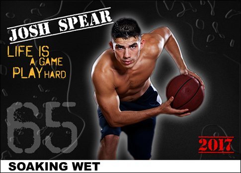
I like the soaking wet template because it keeps the focus on the person.
Action Zone… I photograph alot of track and field and was stuck between Action Zone and Off the Grid. Action Zone won out do to the wrap around light beams being able to become apart of the image and not just part of the background. Gives the image more of a depth of field illusion.
Hard Rain is a great backdrop for this athlete. The image symbolizes both the sweat & determination players put into the sport – by practising hard or in spite of inclement weather.
The never say die attitude & determination on his face matches perfect with the opposing background. The efffect of rain over his chest works great.
PS. Love Big Bang of course, less artsy, but a clean strong poster from any distance. Props.
I like the all but the Hard Rain the most. It gives the effect of never give up. Thats what I always say, It does not matter what happens in life you never give up.
IF THIS REMOVES BACKGROUNDS FROM HAIR ITS A “WOW” AND I NEED IT NOW. THANKS
I like Soaking wet. It has a simple Look that would be good for making these for several people fairly easily.
Love the Big Bang Theory. Very current, urban and grungy looking. Love the Alien Green color as well. Very cool!
I like the first one best
I like the HyperDrive image. I like it because of the crisp clear lines. It is nice and clean, yet bold.
LOVE the Action Zone and Big Bang ones… VERY bold. Love the way the line weaves around his arm… Hard Rain I think would be GREAT for those dirty action football shots…Soaking Wet looks a little generic for my taste. Off the Grid is edgy each one could be great for the right kid, sport, or team…Great Work.
game on. Not too busy in the background taking attenton away from photo. nice and clean
To be honest, I love them all. My two top picks would have to be the Action Zone and the Hard Rain. I think they are both fantastic back drops for athletes… the Action Zone really makes the athlete stand out and you get a real sense of “action” or movement in the photo.
My Fave is the Hard Rain. It has some kinda 3d look to it.
I also like, Off The Grid. I like the target look it has in the background.
I like the Action one the best as it really makes the subject POP. The warm tones give him a nice tanned sheen look and the movement swirls just puts it all in motion.
I like Hard Rain the best. I like the layered fonts & the different opacities. I do think it would be better suited to an outdoor athlete like football or soccer.
I like The Action Zone the best I think. The background seems to fit best for the sport. But I really love the text on Hard Rain.
I like Soaking Wet. I love the “halo” effect around the athlete and the stencil font works well for sports themed images. I also like how the water drops layer boxes in the image. Since I am primarily a sports photographer, I’d have a lot of uses for all these backdrops, but I like Soaking Wet the best.
I like the Actions Zone. It has the perfect backdrop and the yellow lines around the athlete I think makes it pop
Action Zone is #1.
Hard Rain! i love the intense look of the background, mixed with the rain, compliments the “cut out” very well!
Off the grid. It is something that is different and sci-fi look thta the kids like
I purchased these last week and have already used Action Zone and Hard Rain several times. Everyone loves them. My favorite is probably action zone although I really do like them all.
I like “The Action Zone” the best! The backdrop is nice without being overwhelming.
I like the action Zone
I prefer off the grid. Primary reason is that with hue sat / motion blur / lens blur and other changes the off the grid looks as if it would give endless possibilities. For the 3′ x 4′ banners I do the mesh background with a layer mask would allow me to pain out-in wherever I wanted.
They’re all great, it’s hard to choose a favorite! “Off the Grid” stands out as being the most versatile to applications outside of sports – you could use it for any photo where you want to focus on the subject and what they are holding- someone playing video games, hide & go seek, paint ball/laser tag…with a couple tweaks of color, you can even use it for an easter egg hunt scrapbook layout!
I like the Action Zone, I think it is cool how the those lines wrap around the athlete. These would be fun to use for both of my sons’ soccer teams!
All are very nice templates. However, I can easily say I love the “The Action Zone” template. This template layout is dead on! Template is NOT too busy, plus the motion swirls around the subject puts focus on the athlete.
They are all very cool templates and I can’t decide if I like Action Zone or Hard Rain better. Thanks for the chance to win!!!!
I like hard rain looks super
My favorite would have to be ” Action Zone ” to me it has the most movment and would appeal to the greater amount of customers.
i love the Action Zone one. i love the colours and the grungy feel.
I like the hard rain, the background sets the tone with the rain.
Hard Rain….most definitely. It shows more detail and the effects are great. They all look good, but Hard Rain Rocks!!!!!!!!
Hard Rain is awesome looking!! But I also really liked The Action Zone. Both are really great!!
I really liked the hard rain. It really looks like he’s running through the rain. My next favorite is a toss up between action zone and off the grid. I think the last one is a little too green – good if you’re the hulk.
I like the hard rain, it’s a different look. You see a lot with graphics in the background. The image fits well with the background as well. I do alot of sports shots, and this one is great.
Action Zone or Hard Rain both look great.
I definitely like the Off the Grid composite the best because it easily causes the viewer to focus on the subject. The elements compliment the composite very well. As always, very nice work!
I’m loving Action Zone, Off the Grid is pretty awesome too.
I love them all, but I espcially like the graphics of “Off the Grid.” It is rad.
I really like Hard Rain; the backdrop adds a lot of depth.
It draws you in. I can see “Hard Rain” being used for many different applications. Then we could tweak it and change colors and on and on.
My favorite would be the soaking wet. This layout will work with any sport. The hard rain is nice, but the grass looks out of place for a basketball shoot. Not to wild about the big bang layout.
I like the soaking wet the best. It gives the impression of sweat which in this image is somewhat important.
My favorite would have to be Hard Rain and a close second would be The Action Zone.
While I like all of them, my favorite is “The Action Zone”. I think it does a great job of highlighting the player, putting him in a professional background without having an overwhelmingly distracting background. Looks very professional. Would be great to use for all ages and all sports.
I like the Soaking Wet because I think it would look good with more sports.
I like the action zone because of the lighting and the wrap around lines.
It’s a difficuly choice because I like them all, but I guess Hard Rain is my favorite!
The Action Zone and Hard Rain are my favs. If I had to pick one it would be the Action Zone, maybe could use it more.
The Soaking Wet is the best as it has the most impact without the background being too distracting and taking the viewer away from the subject.
I like the action zone the best.
My favorite would have to be Hard Rain.
It’s hard to just pick one so I’m going to give you my to favorites The Action Zone and Soaking Wet. I think these two ready catch you eye when looking at them. I do action sport pictures for one of the local High Schools in my area and sell some of my pictures to the parents, these two parents would by with there kids on them.
Soaking Wet is my favorite. Not because of the backgrounds but because the glow around the subject enhances the subject in the poster. I have used this technique myself in posters for team shots that my family is involved with. I have watched the videos of remask and know how it would become a valuable tool in the cutout especially those shots involving the flying hair of the girls. I use Adobe Premiere Elements in my work.
I like the Hard Rain image. It gives a surreal feel to the photo. Definitely not like anything else I have seen and sets the image apart from a normal action shot.
I like the action zone best … it’s not too busy, and the yellow/gold swirls and diagonals really give a feeling of movement… same is true with the layout of the wording. Nicely done!
I like the action zone best. I really like the colours in it, the lighting effect and the use of texture in the background. It all comes together really well.
Action Zone – I’m a sucker for sports! Looks great!
Gosh! I like them all! I went to my inhouse expert, my 15 year old daughter, who plays basketball! She likes Action Zone for the colors and the Hard Rain. That said from her, I’ll go with the Action Zone for my number one! Thanks!
I really like the first two. The first gives a sense of movement and hard edge which goes well with the athlete. The second adds a real sense of drama and effort to the whole scene. The rain one would work really well with more outdoor sports.
These effects really make a difference in a short amount of time. The Action Zone and the Hard rain are more my taste and preference. Although all of them have different aspect that can be used to jazz any image. I have noticed that the older subjects go for the grunge effects and bright colors then to be the realm of younger children.
I like the Action Zone. I like the way the glows go around the arms.
I love them all. You cant go wrong with Easy Digitals!!
Action Zone and Hard Rain are my favourites, although the later may not be quite as versatile as the former.
I liked soaking rain. I liked the glowing effect around the person.
I like the Action Zone and Hard Rain are my favorites. ther are all good though.
I like the rain one with all its colors. Its great
I like the Action Zone the best. It just all works well together. I like the rain one artistically, however, tying rain to sports is a little stretch for local sports scene. My least favorite is Big Bang Theory, too much background.
Hard Rain! When you are competitive, no weather can stop you!
Off the grid is my favourite but the Action Zone is a close 2nd
Really love the “Hard Rain”. He seems to “Pop” around all the rain. Colors blend really well. I actually liked all of them but the Big Bang. Too bright of green, took away from the subject Thanks! Can’t wait for the drawing & announcement of the winner.
Ok, So I think the one I like the best is the 1st one. it doesn’t distort the picture in any way and just adds to the emotion and fiercness (not sure if that’s a word) of the entire shot. Hard decision, cause I really like them all!
I really like the Action Zone. The lighting is perfect. The hint of orange glow on the right really blends well with the light on his side. Out of all the other examples, I think this one shows a more dramatic look. Wonderful work
I like the rain the most out of the selections. In my opinion, certain shots look better with rain, especially some sports shot such as football etc. Althought the shot i picked is a basketball theme, I can picture the person playing on a neighborhood court in the rain.
I like the first one, Action Zone. I like the colors in that one the best. It just looks sharp!
I like Aciton Zone. The swirl defines the subject. I also like Hard Rain. It gives the athlete respect. Plus I can see how versaltile this background can be. I can see kids playing or couples running in the rain.
It’s a tie for me between Action Zone and Hard Rain. I like the wrap around of the lightening in Action Zone, and love the coloring in Hard Rain.
I really love Action Zone for the swirl and the spotlight type lighting, and I agree it can be very versatile as well. But my overall fav is Big Bang. The simplicity of this template (although I know there is nothing simple about it) really emphasizes the athlete. There is nothing to distract from the athlete and as a parent who would consider purchasing photos/posters of my son, I want him as the primary focus. IMO, this template does just that.
I like the hard rain background. It has a nice flare to it. It is versital and can be used for almost any sport.
I like the Action Zone. I like the way the swirls really set off the players
I like “Action Zone” the best. The swirls give it that ‘how’d she do that’ look. I think younger kids would like “Big Bang Theory” if the green could be changed to their team color. That green seems a bit strong.
Hard Rain because it reminds me of hard work and determination.
It is difficult to choose just one image. My overall favorite is “Hard Rain”. It emotes the determination and drive of an athlete who will train through nonideal conditions. The “Action Zone’s” swirl around the player is what I gravitate to with this image. It focusses one’s attention and gives a sense of movement. The “Big Bang Theory” background is fun, I especially like the font and the colour.
Thanks Kim, I always enjoy viewing your creativity!
Action Zone gets my vote because the edges of the model blend smoothly with the background, making it look more ‘real’.
I like them all, maybe “Hard Rain” would be my top pick. I like the rain overlay and the colors blend in well.
Action Zone, I like the design, the swirls are nice touch.
Hard Rain looks the coolest to me. I have purchased lots of easydigital products and they have all proved to be easy to use with great results.
My pick is the “Soaking Wet” design. The simple, uncluttered background and glow around the athlete places emphasis on them as opposed to special effects or artwork that sometimes can clash or over power the photo of a player. I also like the “life is a game, play hard” quote as well as the personalization incorporated in the design.
I really like the hard rain background, I can think of lots of applications that would work with this… but my favorite is the Action design. I like how you can use the glowing light beams work within the layers.
I like the first one with the ribbon around the action figure. It is something I cannot do well and I can appreciate it more I think. It is a wonderful effect that really puts the focus on the athlete. I think just a little glow around the athlete wold make that one perfect!
My favorite layered backdrop is definitely the “Hard Rain” hands down! This is an awesome display of sheer determination and drive on the person depicted in this photo. The rain, and the wet look he is portraying, give the effect that he is actually playing a sport in the rain, and very determined to make the play count. Obviously another great product from Easy Digitals, that takes the ordinary and makes it extraordinary.