Do you know what you or your customers are going to do with the posters you create for them?
Ask! It’s always nice to have a good idea of where your poster designs are going to be displayed in a home. This allows you to customize the look of any space. You and your customers will be excited with the results.
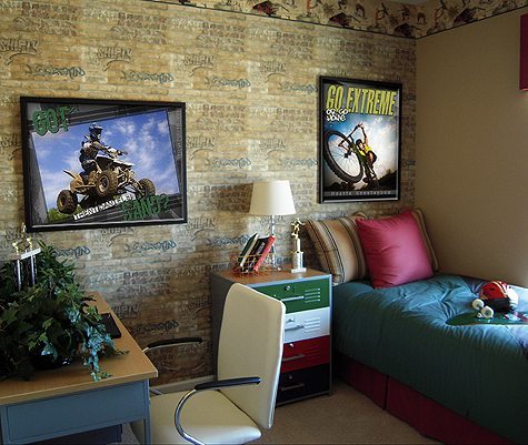
For this boys themed room I desaturated the titles to go with the more muted tones of the space. If I had left them in the bright tones that matched the image, it would have over powered the space. The muted tones now fit perfectly with the grungy room.
So don’t forget to ask where the image will be displayed so that it compliments the space.
